Contribution:
Research, Prototype, Strategy
Team:
1x Designer, 2x PMs, 1x Manager
Duration:
12 Weeks
The current data monitor creation flow lacks adequate visual feedback and guidance for users.
Users are unsure about how their monitors are being evaluated, how to improve their monitors for better accuracy, and select optimal threshold values. This is causing them to constantly edit their monitors after configuration, and play a guessing game to see whether their monitors will be optimal for accurate data collection and incident notification.
So, what is the solution?
The introduction of a new data monitor configuration page layout and a series of additional interactive components and data visualizations which allows for real-time editing and user feedback to guide users in the proper direction.
BACKGROUND
What are data monitors?
Monitors help SREs (Site Reliability Engineers) understand when critical performance changes are occurring in their applications. Users can create monitors that actively check metrics, integration availability, network endpoints, and more.
DESIGN PROCESS
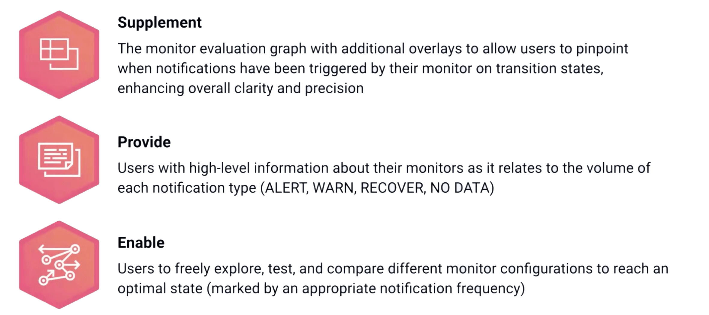
The main goal is to offer SREs a single solution for configuring and editing monitors.
Keeping the experience simple while integrating more visual feedback and guidance. Additionally, we want to allow users to explore and test monitors freely without needing to create a new one for every edit they make.
I analyzed Datadog’s APM Logs Management platforms to identify design patterns and areas for improvement, directly informing enhancements to the Monitors page.
These products had similar, yet slightly different design patterns which was used as a source of information for the Monitors page. I also annotated aspects of our existing platform by identifying potential areas of improvement and components that appeared to be confusing from a first-time user perspective. My goal here was to develop a mental model of the overall product.
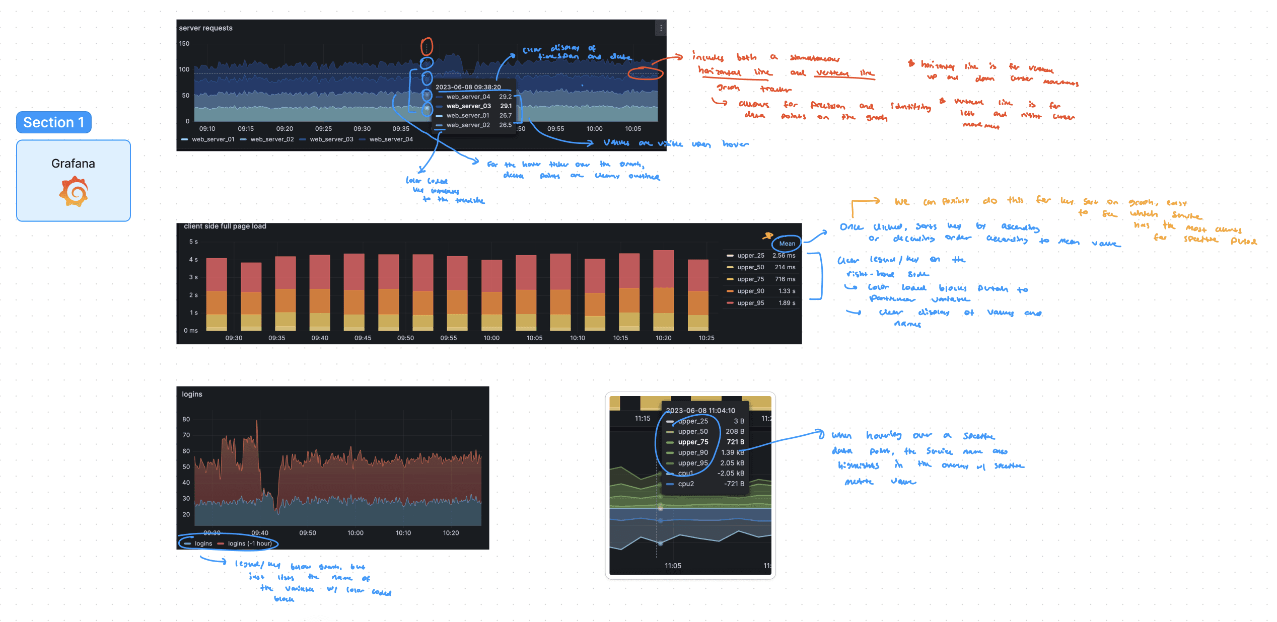
Additionally, I looked at competitor products like Grafana to identify unique layouts, interactions, and functionalities.
From my research, I identified components such as data tables, tooltips, tiles, and modals that all served a different purpose in communicating pieces of information, and enhancing a user’s understanding. Additionally, I took note of the interaction patterns on hover and clicked states, as they often correlated with the data point portrayed on the visualization. The competitors I analyzed were Grafana, New Relic, Splunk, and Cisco.
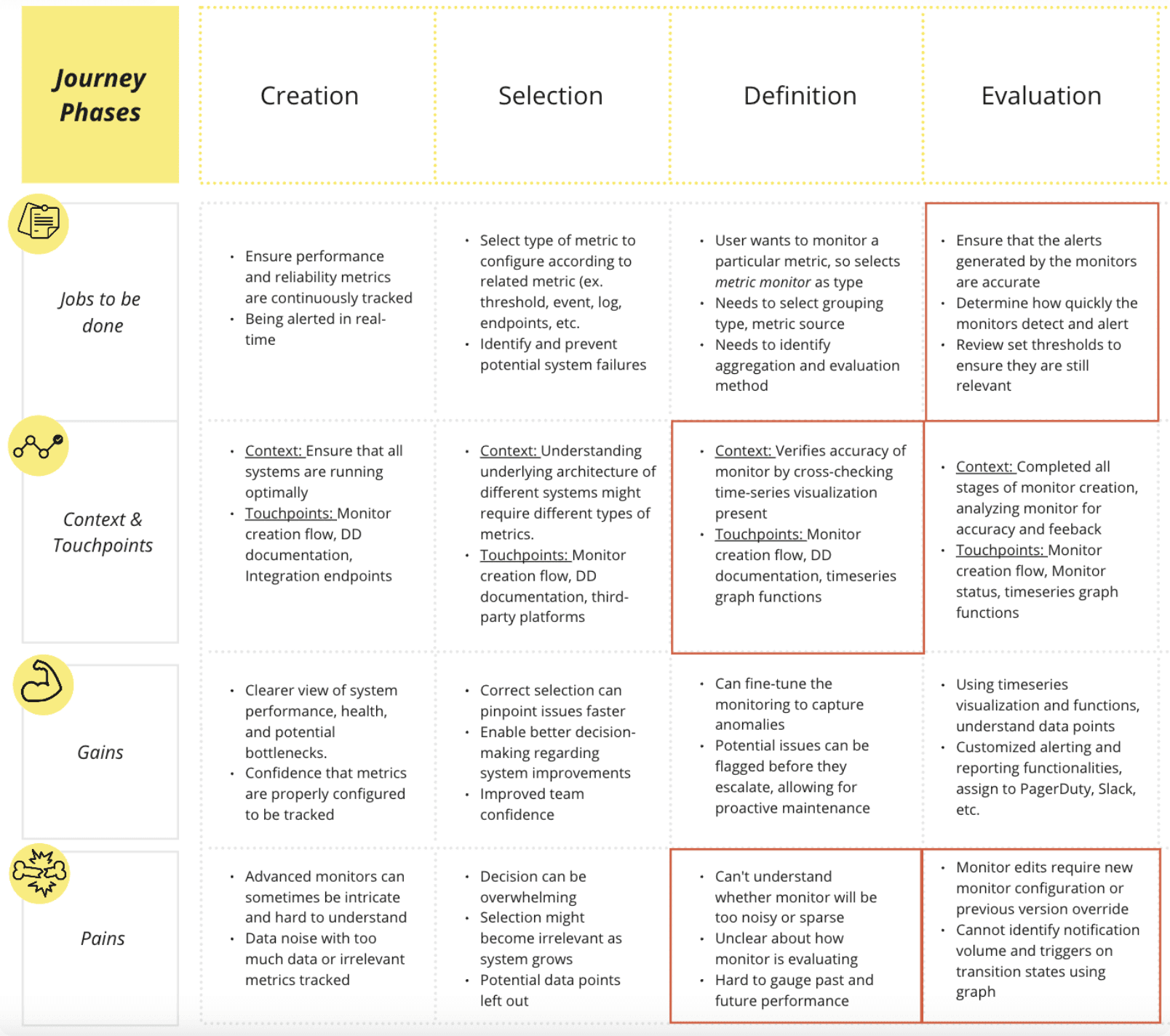
The main pain points in the user journey were identified in the evaluation and definition stages of monitor configuration, hinting at a need for greater accuracy and testing.
Below is a user journey map that outlines the various jobs, touchpoints, pains, and gains an SRE experiences while going through the monitor creation process. It’s important to note that the red squares indicate the most pressing opportunity spaces in the user journey, as highlighted by RUM (Real-User Monitoring) analysis and understanding customer support tickets.
IDEATION + DEVELOPMENT
This video highlights the existing design of the monitor creation/edit page, which was the main focus of the project.
Based on the current user experience and the various pain points SREs currently face, 5 key areas of improvement were identified.

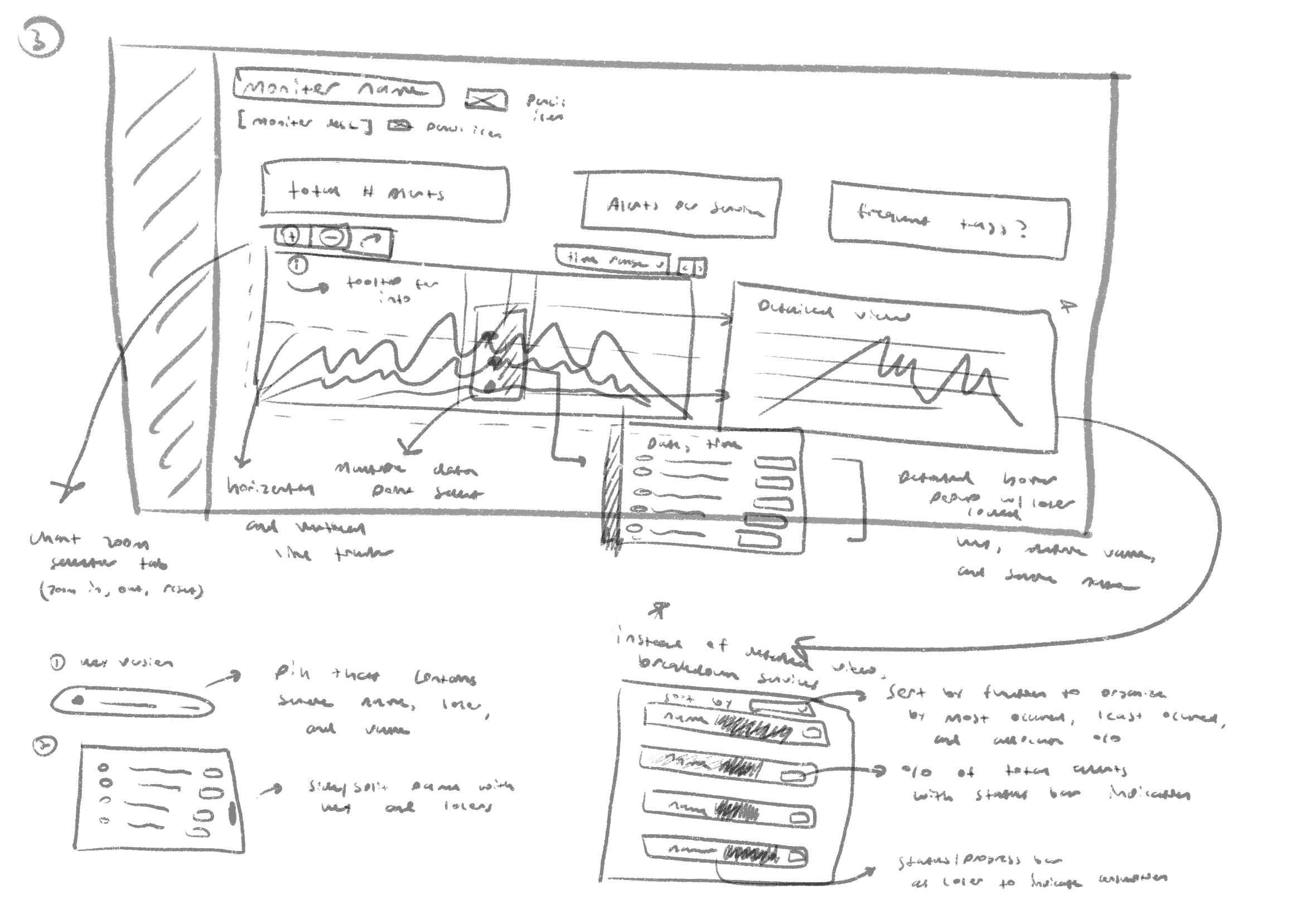
It was time to go to the drawing board, and sketch out wireframes which detailed different overlays and page layouts. Here, I focused on allocating space for high-level metrics, and detailed tooltips.

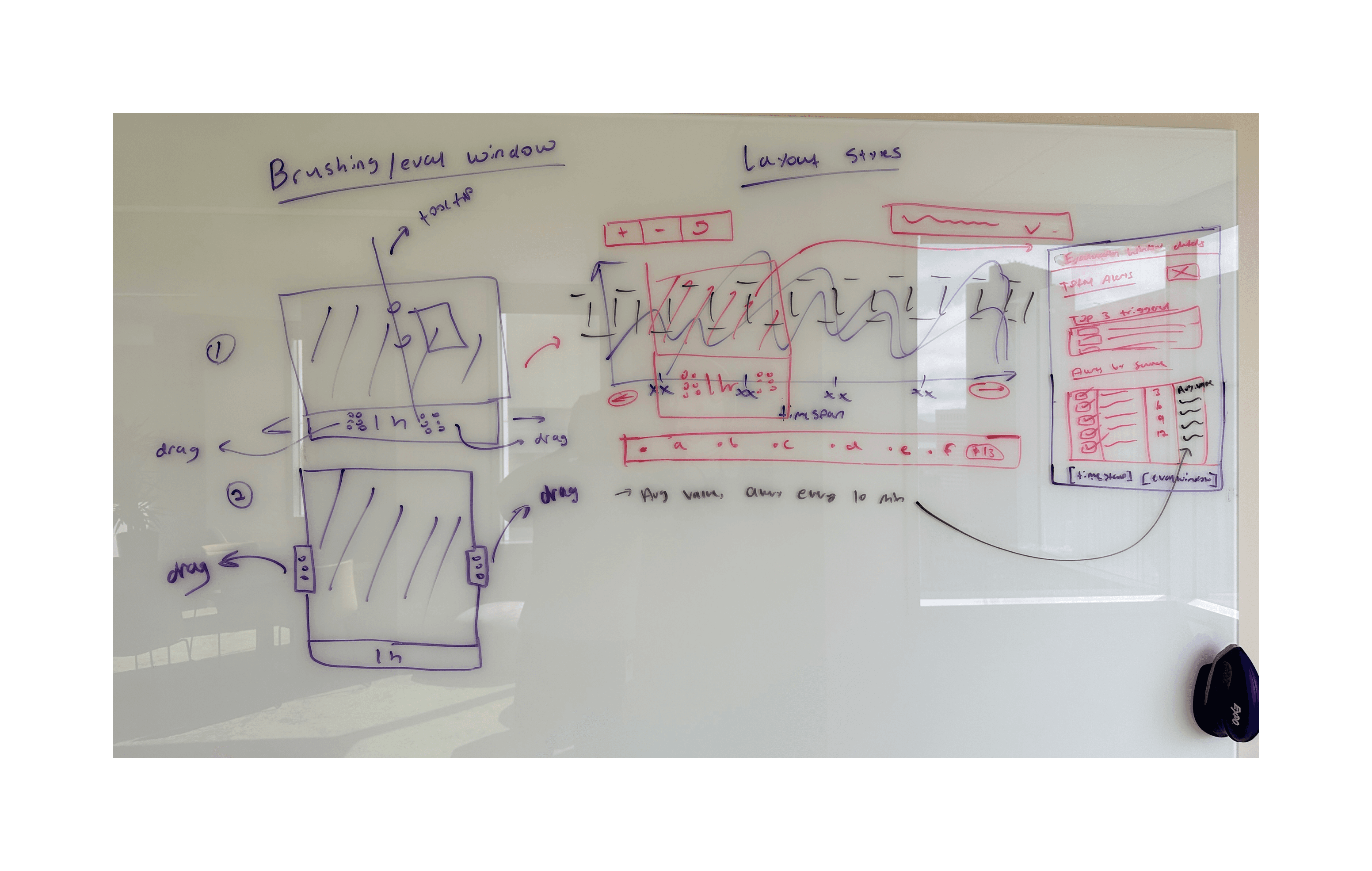
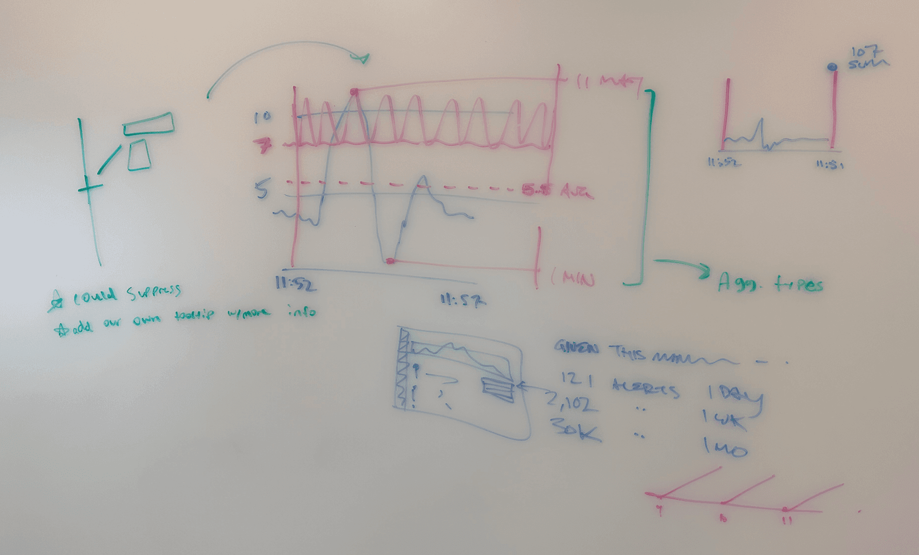
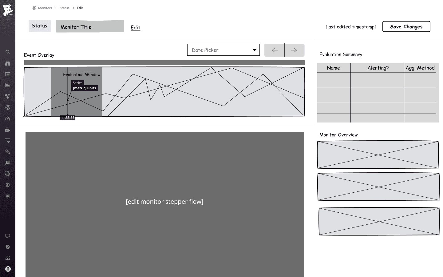
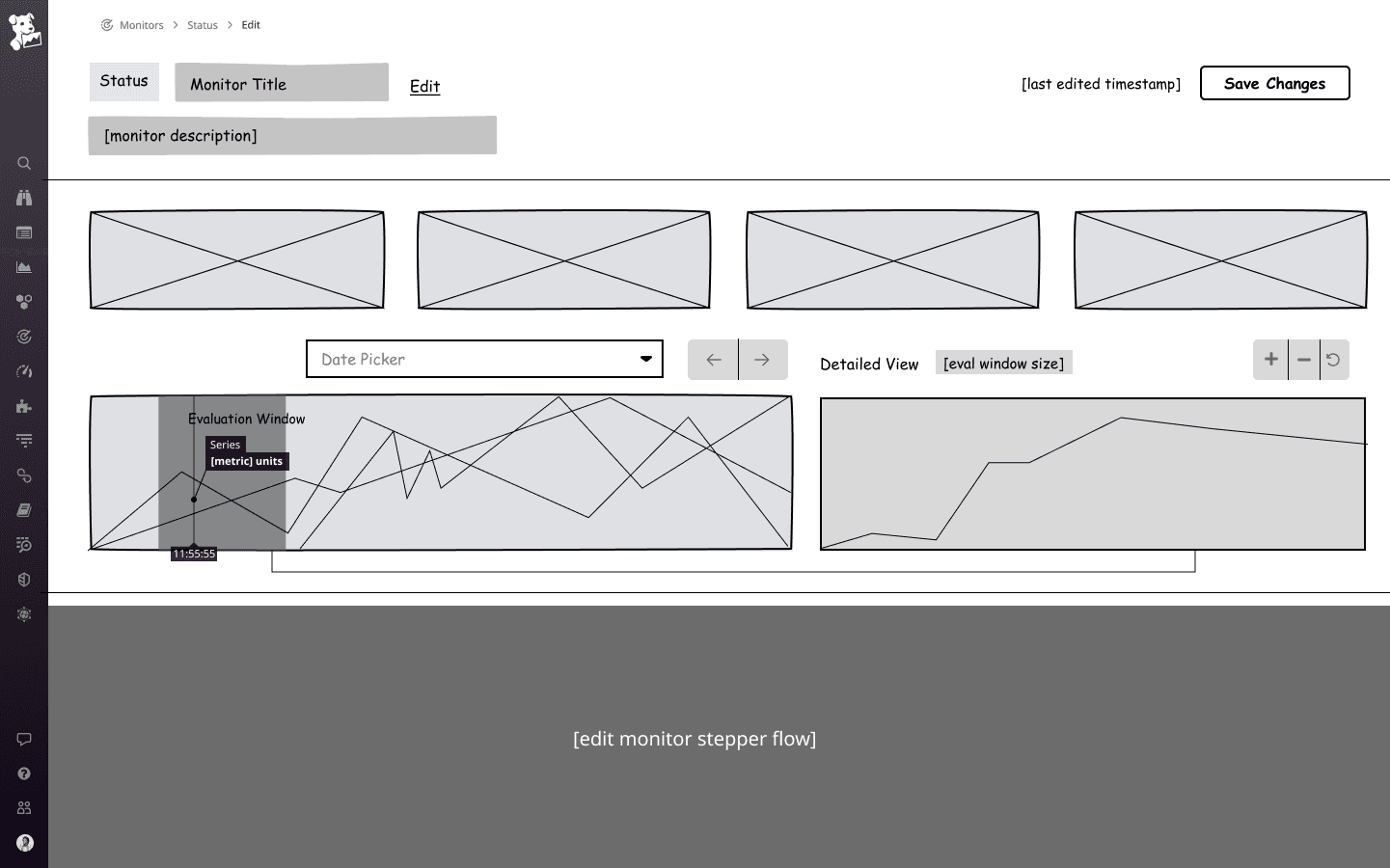
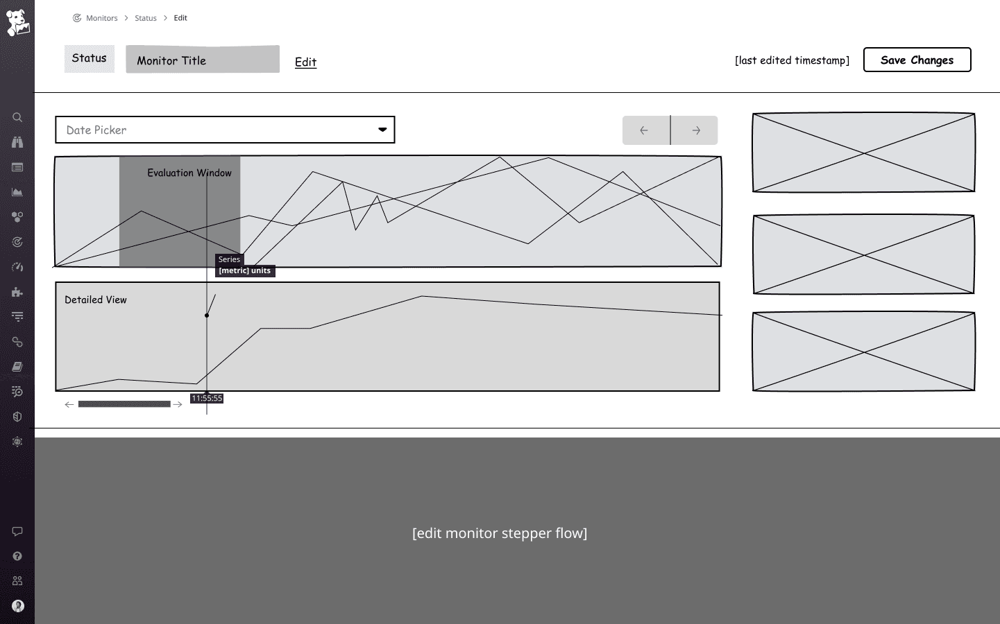
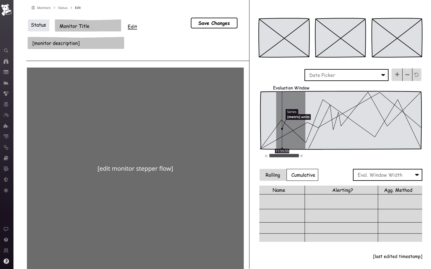
I then converted these wireframes into low-fidelity screens. The core components included a time-series graph, configuration stepper, and card components for high-level metrics.
Based on existing design patterns, a 3-block layout [image 1] was the most optimal for displaying each component clearly in a single view, while maintaining the width and detail of the time-series visualization.
HIGH-FIDELITY PROTOTYPE
After finalizing on a layout, I used Datadog's DRUIDS design system to create high-fidelity screens. I developed a total of 30+ screens with reusable components and existing design patterns. Four key changes are detailed below.
01 —> The page features a three-block layout with a sticky scrolling timeseries evaluation graph at the top, followed by a monitor configuration stepper below it. Additionally, a collapsible side panel provides a high-level summary of metrics, including a group breakdown of top alerting groups and notification recipients


02 —> The rolling evaluation window dynamically updates based on the user-selected query period, while the event overlay bar, in greyscale or full color, shows notification volumes and transition states. Enhanced tooltips provide detailed breakdowns of each notification type when hovered over.

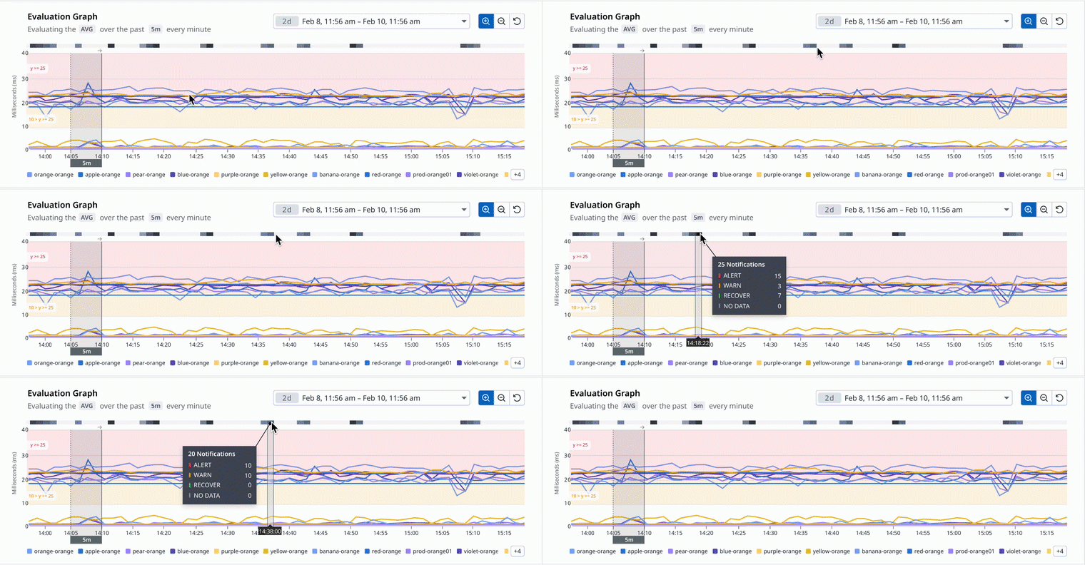
03 —> The high-level metrics overview provides a notification breakdown by ALERT, WARN, RECOVER, and NO DATA states, with a stacked Toplist graph showing notification volume by monitor group or recipient. Dynamic comparison allows real-time updates of metrics and monitor groups, enabling users to test and compare different monitor configurations for optimal outcomes.

04 —> A dynamic window expands visually during the evaluation period, reflecting the current time. A new timeseries visual illustrates the SUM aggregation method by rolling up data points into a single line.

DESIGN TRADEOFFS
I prioritized readability, designing for handling millions of data points, spatial awareness, and aligning with natural user viewing tendencies. I made various design choices accordingly.
While the goal was to provide a new and refreshed experienced for data monitor configuration and editing, we needed to make sure to stay true to the existing design patterns and think about how to adapt to data scaling. Below are a few other iterations of the core monitoring screen, where different card layouts, tables, and tooltips were experimented with.


VISUAL DESIGN
I referenced the DRUIDS Design System components and documentation to ensure consistency in the visual identity and a seamless product integration.
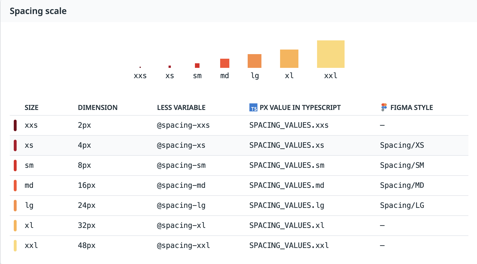
The design system consisted of common design patterns, components, and accessible color schemes that were apparent across Datadog’s core product interfaces, so it was essential to maintain this consistency to create a familiar experience that resonated with the user base. Referencing aspects like typography scaling, spacing, grids/layouts, and component behaviors were essential for crafting an accurate, and product-ready prototype.


MEASURING SUCCESS
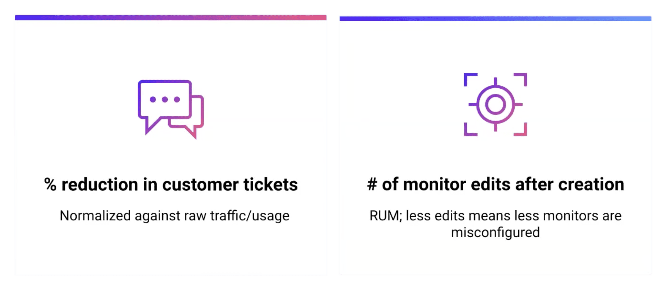
To analyze whether this proposal was successful, we can analyze the reduction in customer tickers and how many edits a user has to make to their monitor after configuration.
Wrap-Up
In the end, we designed a more interactive experience offering effective guidance for monitor creation and customization.
This solution addresses the confusion users had faced with configuring their monitors by offering them a more interactive way to test and deploy monitors, and removing the guesswork associated with it. Users can now create and predict the success of their monitors, leading to more effective data collection and alerting processes.
What were some of the challenges faced?
I tackled the complexities of Datadog’s product and design patterns on a tight timeline, focusing on data visualization, space-efficient layouts, and working through conflicting feedback, while designing a solution tailored to a technically knowledgeable user base.


